People get aggravated when software gets in their way. Delighting them is a great way to ensure they have high opinion of your product.
I’ve been thinking about the importance of delighting users lately. People get aggravated when software gets in their way, preventing them from getting something done. Assuming your application is solving your customers’ problems in a reliable and consistent way, delighting them is a great way to ensure they have a positive experience and a high opinion of your product–and use it with more frequency.
Of course, coming up with ways to delight users can be a bit difficult. But at the end of the day, delighting users is about solving a specific pain. Users need to be able to achieve their goals without any friction. This means that when you’re trying to come up with ways to delight users you need to be thinking in terms of benefits and outcomes.
Here are 6 ways to delight your users, along with examples, that you can use when brainstorming ideas:
- Personal
- Convenience
- Prediction
- Elimination
- Clarification
- Alleviation
Personal
Software is an abstraction layer between user and machine. This means that communication applications often lack the one thing they need to be good at–a feeling of connectivity between people. Depending on the application you use, sending an email or text does not feel anything like a real human interaction. However, this does not mean you can’t find ways to make these moments feel more personal.
iMessage does a good job of making conversations feel personal.
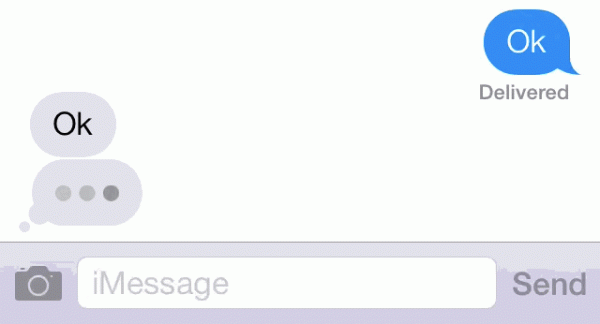
The flashing ellipses confirms to the user that they’re interacting with a real person at the other end. They have faith that when they click the send button their message isn’t being sent off into the void.
This tiny element matters. It makes the moment personal.
Convenience
Most applications offer some form of convenience. But those that do so in a delightful way will pretty much guarantee they’ll be loved by users.
Firefox’s picture-in-picture video feature is a great example of a delightfully convenient experience.
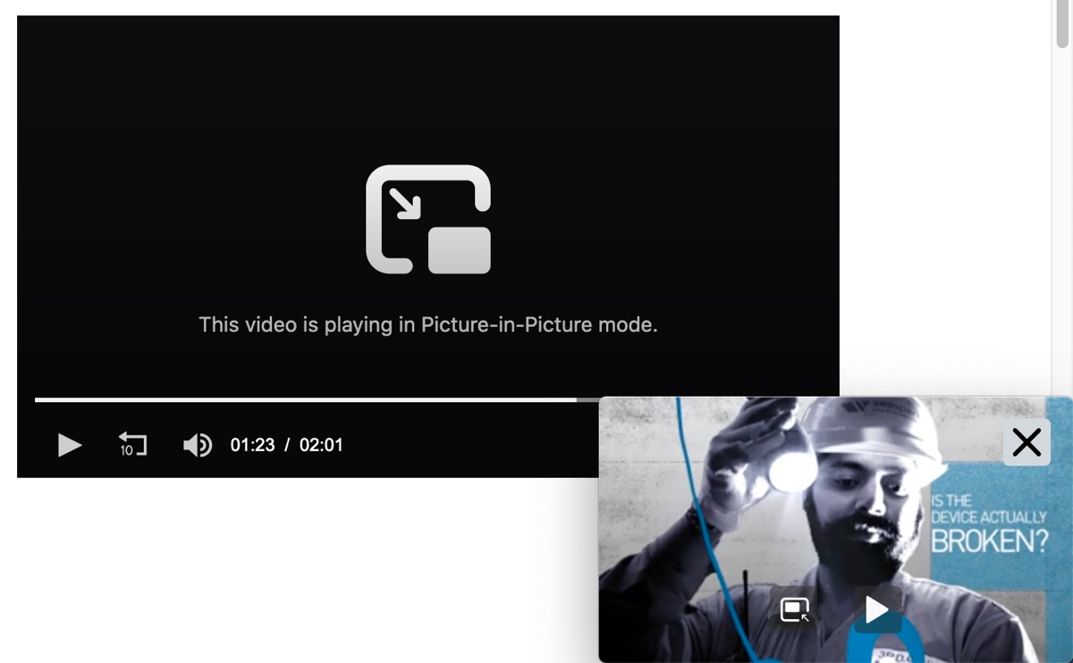
Firefox Picture-in-Picture FeatureFirefox’s “Picture-in-Picture” feature lets you watch videos while moving between websites.
Just click the “Picture-in-Picture” button in almost any video and you’ll get a little video player that plays no matter what website you go to. You’re no longer stuck on the page–the video follows you wherever you go.
I use and love this feature all the time when listening to interviews or talks. I don’t care about seeing what’s going on. All that matters to me is the audio.
Prediction
Predicting what people want or need to be done for them at the moment they need it is a fantastic way to delight users.
SmallPDF offers a collection of tools for editing PDFs in the cloud. I often use it for merging multiple PDFs together. The feature that nails the delight-ness quotient is how it predicts the next action you want to take. For example, in my case, once a handful of PDFs have been merged, you’re offered a few other options–one of them being to download a compressed version.
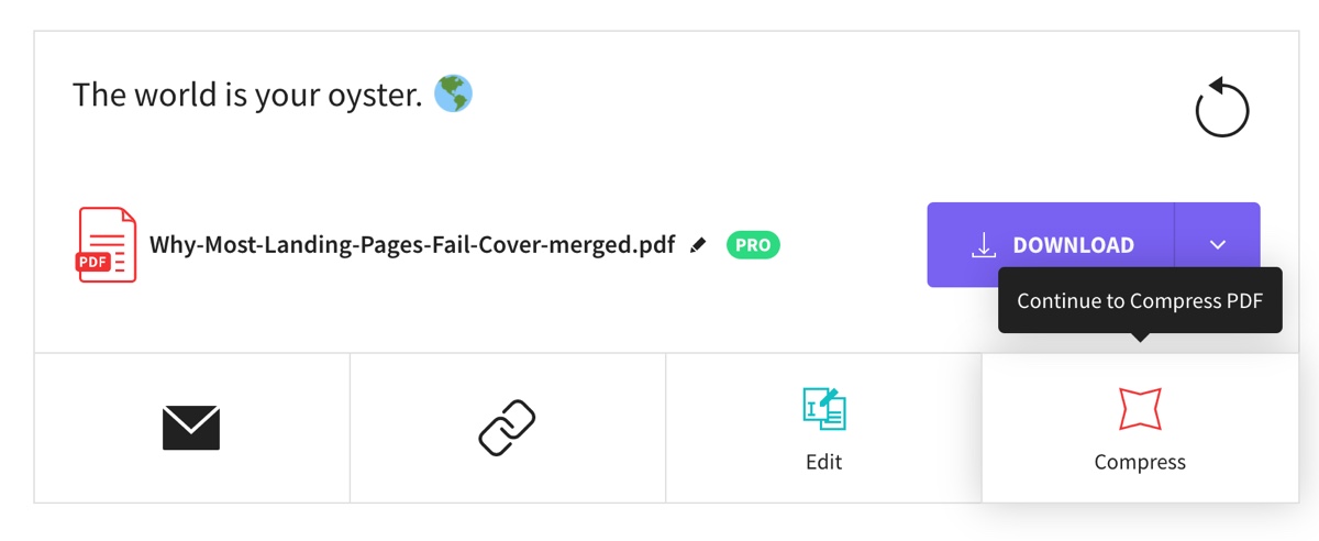 SmallPDF Compress Feature SampleSmallPDF’s predicts the next action you’ll want to take.
By predicting the most common actions after multiple PDFs have been combined means people don’t have to go through a whole other process again–they just click the “Compress” button and presto!
Notice how the “Download” button is prominent. It’s the most common action that people will want to take. Then there is a lineup of other options. You can’t help but hover the cursor over them. Doing so reveals a help tip that gives a bit more of a clue as to what they do. They’re clear but unobtrusive should you only need to download the PDF.
This is a tiny but important design decision. They could have called the options are more with popups or colored borders. However, they wanted the interaction to be a bit more subtle.
Elimination
If you’ve developed on top of an API then you know a good portion of your time is spent reading documentation. Problem is, you want to quickly test something without having to launch your code editor, copy over the samples, launch your environment, then run it.
Postman offers a nifty little button that you can embed into your API documentation page. Above is a screenshot of it on Square’s API page. Just click the “Run with Postman” button and Postman launches where you can start playing with Square’s API.
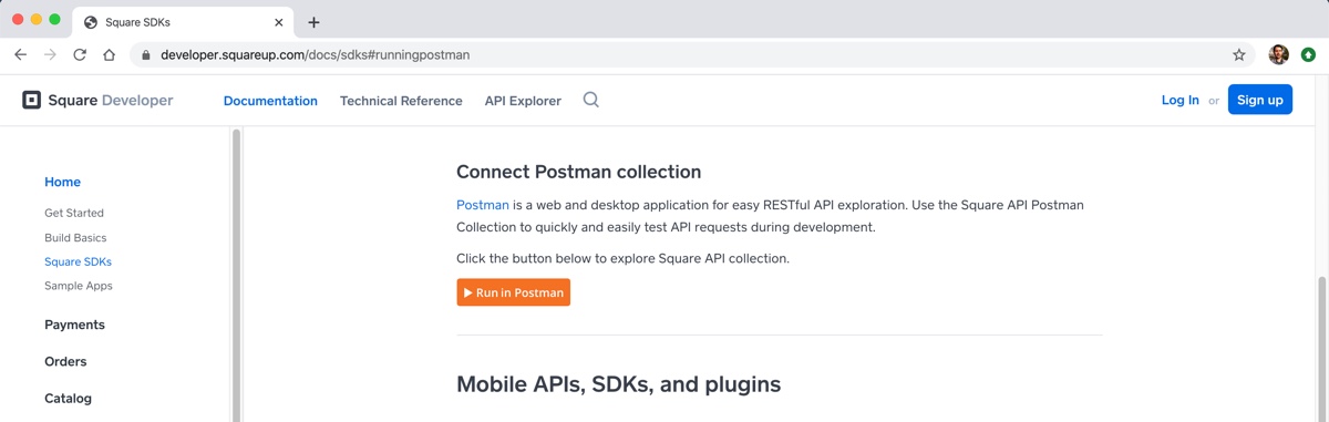 “Run in Postman” Button in Square’s API Docs.
This not only does the button eliminate work for the end-user (the person testing the API) but also the customer (Square, in this case, who does not need to develop a tool themselves).
Clarification
Software is pretty abstract so communicating concepts clearly to users is critical. If people don’t know what’s going on they’re going to be lost, confused, or angry.
Here’s a great example Apple implemented into their login screen for when people forget their password. Rather than just displaying a “password incorrect” message, the password field shakes back and forth.
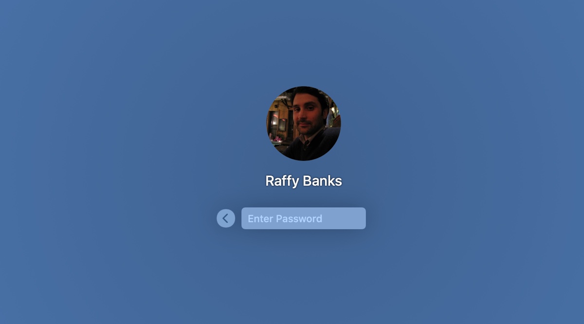 MacOS login screen shakeEnter your password incorrectly and the password field does a head shake.
Mimicking a head shake is a clear visual and friendly cue and friendly. So friendly that it’s difficult to get angry when you do forget your password.
Alleviation
“Copy” is often overlooked as a means to delight users but it’s probably the most impactful. There’s nothing to develop and it takes just some brainstorming power.
A great way to use copy is to alleviate anxiety. Here’s an example:
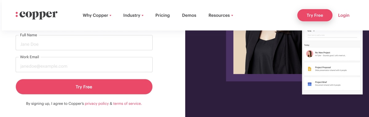
This is the homepage for Copper. They sell CRM software. Notice the CTA on the button.
“Try free”
Think about what that does, persuasive wise. It subtly gets your mind away from all the work that goes into setting up a CRM application. It gets you focused on just trying it out. It solves one of the biggest pains when signing up for an application. Things like training, configuration, data migration, et al.
You’re not thinking about all the work you have to do. It’s anxiety-inducing just to think about and they alleviated it with just some copy and A/B testing. And that’s a delight!
So, when you’re trying to come up with ways to delight users, think in terms of the pains you’re trying to solve and the types of benefits. It will make your job a whole lot easier.