A poorly worded alert is at best going to stop someone in their tracks and confuse them. At worst, it’s going to piss them off.
Here’s an alert I received when I attempted to quit TeamViewer:
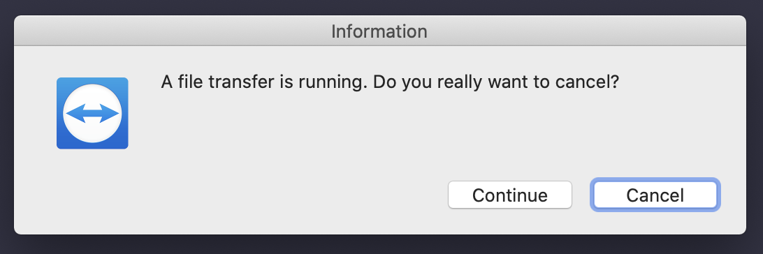
Confusing alerts stop people in their tracks
I didn’t recall transferring a file. All I wanted to do was quit the application. And I had no idea which button to click.
Do I click “Continue” to continue with my previous action, quitting? Or does that continue with the file transfer? Or do I click “Cancel” to cancel the file transfer? Or does that cancel the closing of the application and continue the file transfer?
I felt like an idiot. Surely, I could not be the only one.
Alerts are opportunities
Any moment where a message is presented to a user is an opportunity to delight them. If you can present an alert that doesn’t get in someone’s way, then you’ve succeeded in delighting them.
Here are a few guidelines for creating alerts that are actually helpful
-
Only display alerts if absolutely necessary. Alerts are often used to save users from themselves. Their intention is to warn someone about a situation that could lead to data being lost or prevent a mistake from being made or get a double confirmation.
-
The message should convey a single idea. The message must be clear and concise only convey a single thought or idea.
-
The actions should relate to the message. The buttons need to be obvious answers or actions to the message. No matter the situation, the user must understand the consequence of clicking each of the buttons.
-
No surprises. The user must know precisely what will happen if any one of the buttons is clicked.